Flashfood
Redesigning grocery shopping to tackle food waste problem
Flashfood grocery app is an app that allows grocers to sell surplus food that is almost expired and allows shoppers to browse those food items, buy them at a discount, and pick them up in-store.
Flashfood had gone through some redesigns done by several agencies and firms. This caused problems of inconsistency and context lacking in the design. I was tasked to redesign the Flashfood app focusing on business growth and shoppers shopping experience. The ultimate goal is shoppers can have a coherent and new way of grocery shopping that allows them to reduce food waste and save money as well as a solution that can scale.
I was the only designer working with a project manager and two developers on this redesign project. I used several methods such as heuristic analysis to audit the then state of the app, extensive market research, and journey flow to better understand how Flashfood would fit into their grocery shopping experience, as well as prioritization. Part of the final solutions was to define underlying principles of designing for consistency, modularity, and modularity.
ORGANISATION
Flashfood
MEDIUM
Mobile app (iOS, Android)
TIMELINE
2 months, January 2018 - February 2018

A map that indicates grocery stores that partnering with Flashfood, as well as its corresponding horizontal list
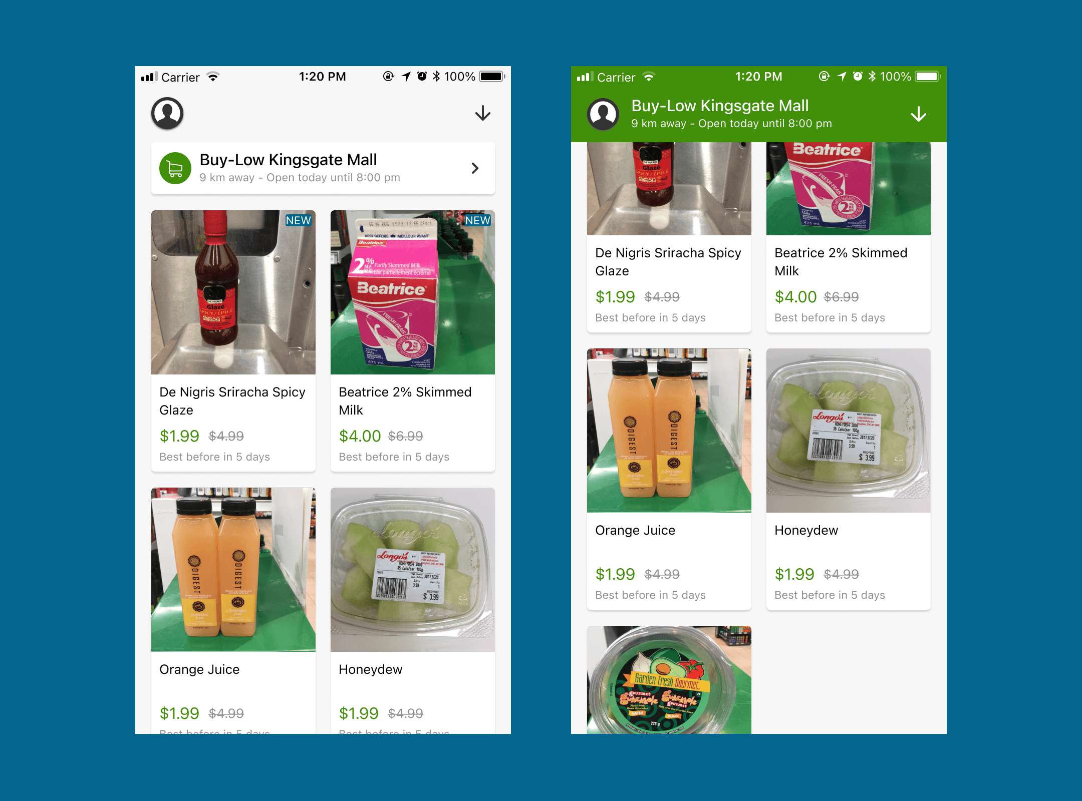
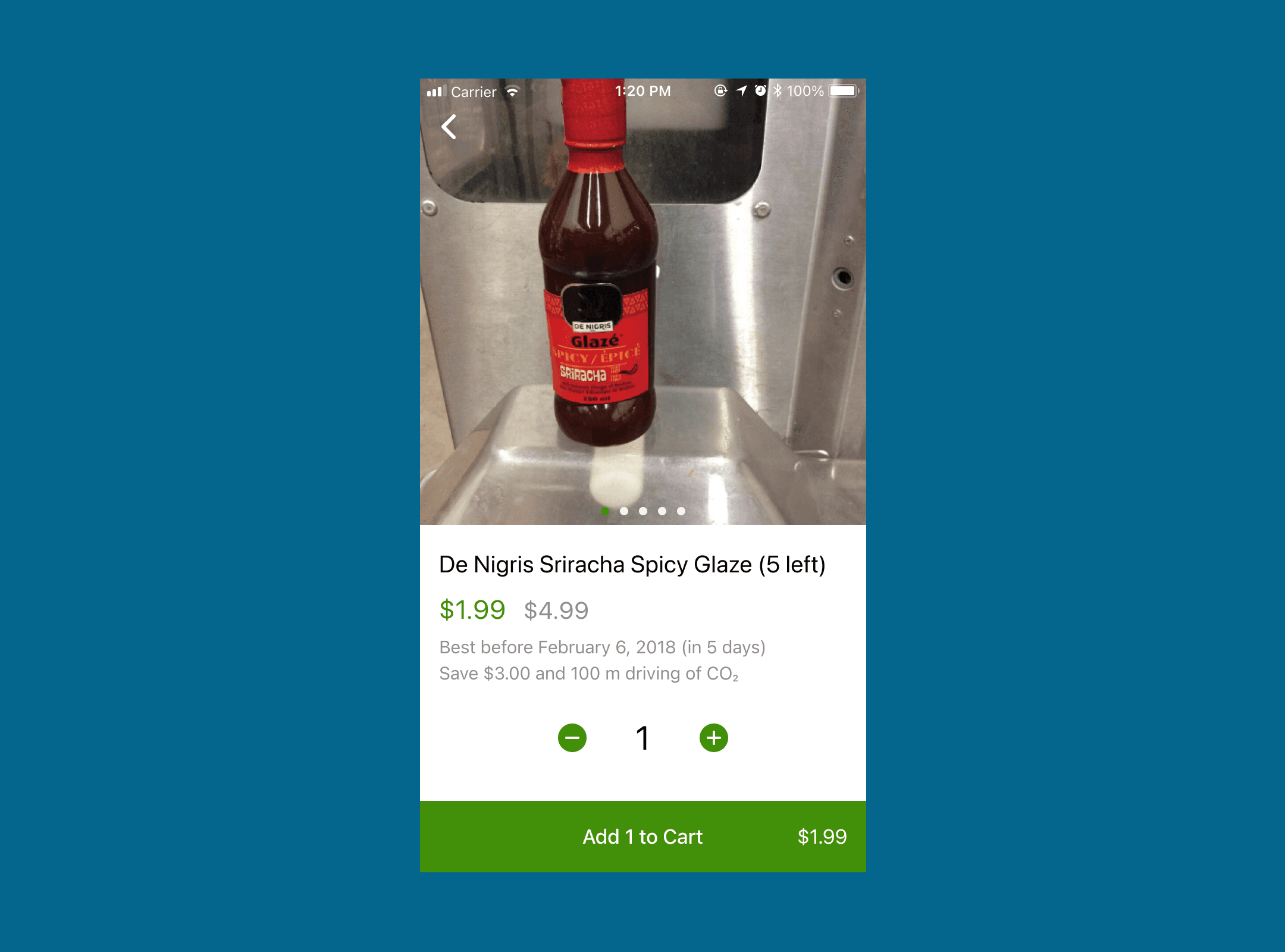
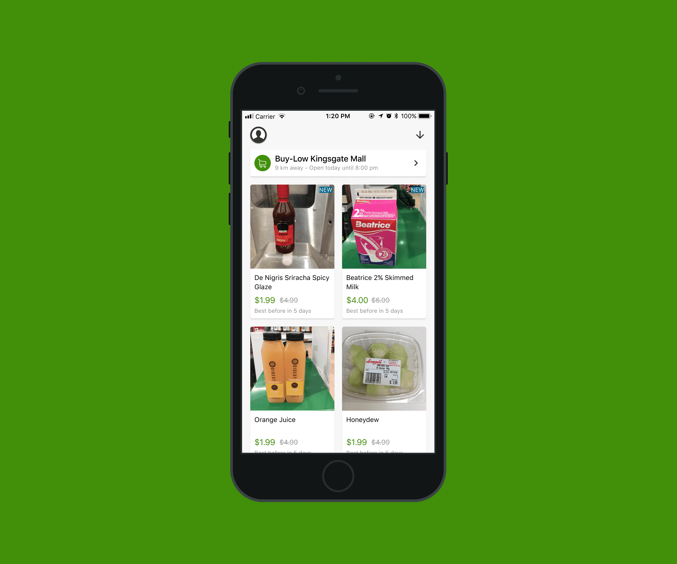
Almost expired products of a grocery store listed on Flashfood
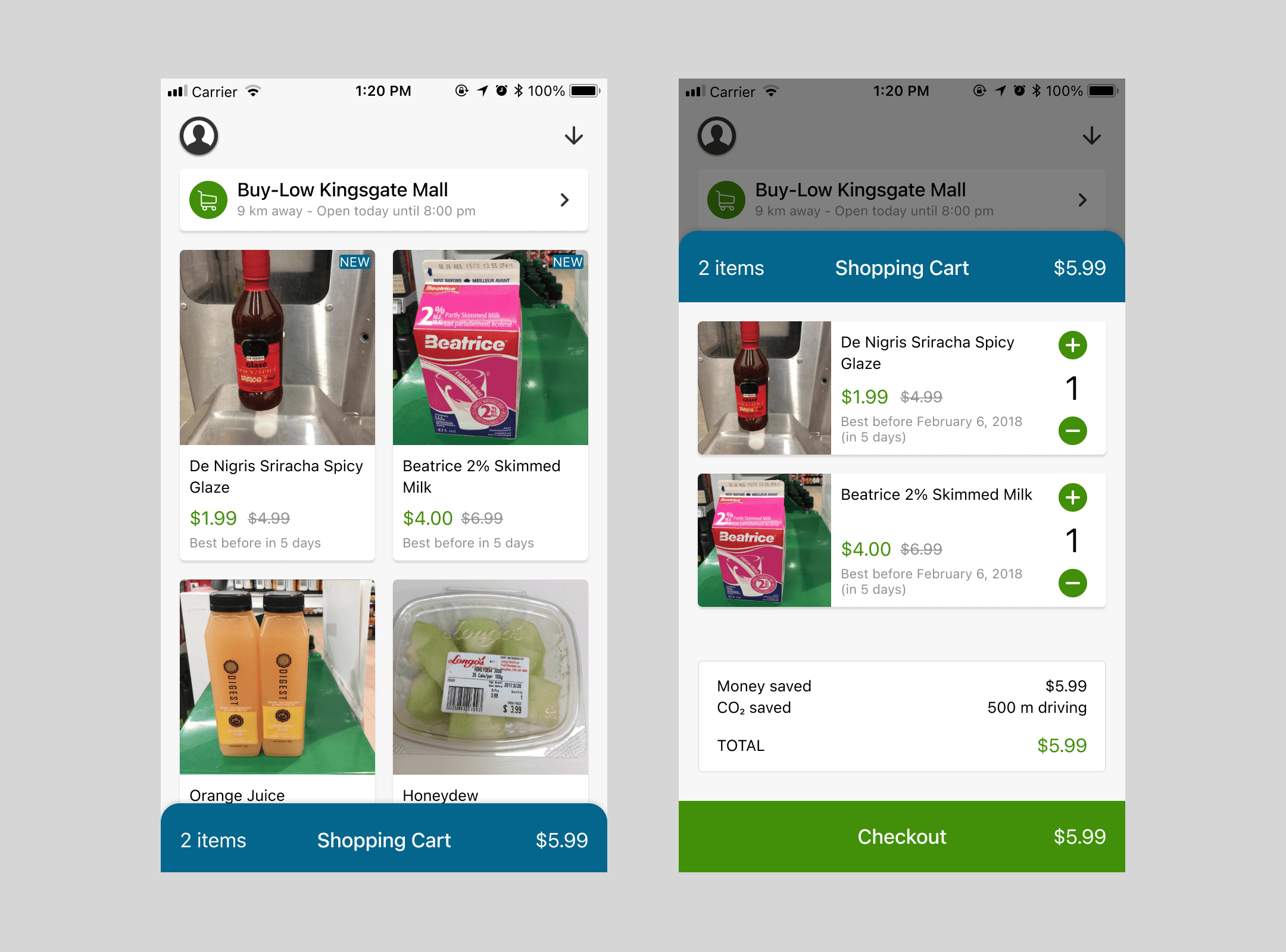
Cart indicator when closed and cart view when opened
Results
Two new partnerships (Target and Loblaws), from <10 to 400+ grocery stores.
Increased number of users and user retention who completed transactions (~10% increase).
From #70 to #5 on Food & Drink apps on the App Store Canada.
Learnings
Reusable and modular components accelerates the exploration and iteration process
